 Frederic W. Goudy, Greatest American Type Designer, Has Left His Imprint on the World by Creating More Than 100 Beautiful Faces to Give Dignity and Simplicity to the Pages on Which Man Records His Dreams
Future generations will know Frederic W. Goudy as the man who left a greater imprint upon the recorded story of his time than any historian or craftsman living today.
At 40, this short, plump, pinkish, and puckish gentleman kept books for a Chicago realtor, and considered himself a failure. During the next 36 years, starting almost from scratch at an age when most men are permanently set in their chosen vocations, he cut 113 fonts of type, thereby creating more usable faces than did the seven greatest inventors of type and books, from Gutenberg to Garamond. Now 76, he is the dean of twentieth-century designers.

Some of Goudy’s original drawings for Scripps, his 113th font of type, note the identifying No 113 and dates that give a record of different operations.
Chances are you never heard of Goudy. He is a printer’s printer. As art adviser to the Monotype Corporation, his expert eye scans every drawing before it is translated into type. He is type consultant for Underwood Elliott Fisher, manufacturers of typewriters and other equipment. In his 200-year-old frame home, which overlooks a small stream splashing across a 10-acre estate at Marlboro-on-the-Hudson, 70 miles from New York City, he executes for customers from Massachusetts to California original designs, from drawing to the finished metal. His name spells authority to those who know type.
Goudy travelled 25,000 miles last year by train and airplane, preaching to printers the gospel of simplicity, beauty, legibility, and dignity. “The perfect type,” he tells them, “would be completely invisible.” But since invisibility would defeat its purpose, which is to carry a message, he endeavours to approach that ideal as closely as possible. You never see a flamboyant character among his designs.
|
|
  |

“Creation” to this old master consists not in jumbling several styles and copying the best features; rather, he draws on a well-stocked granary of knowledge kept filled by daily study, adding to tried and true forms any new impressions as they reach his eye. Perhaps 30,000 University of California alumni have locked in their trunks or framed on study walls examples of his craftsmanship, and probably fewer than a dozen know that Goudy’s hand touched their sheepskins.
Thirty-one years ago, he visited the Louvre in Paris. While wandering among the galleries, his attention was drawn to the stone tablet pertaining to Hadrian, Roman emperor who reigned in the second century A.D. In a few minutes, caught by their classic beauty, he made a simple rubbing of three letters, P, E, and R, just as one may transfer the relief of a coin to a piece of thin paper by rubbing a soft pencil over it.
For seven years the rubbing lay in his desk. In 1917, when searching for a “diploma idea” he remembered those letters. Before retiring that night, he had filled out the alphabet and completed his sketches, making no change other than smoothing out the chips worn by time in the originals. Every year 4,000 California graduates receive sheepskins bearing replicas of those letters taken from the Stone of Hadrian.
Goudy calls the type Hadriano, in honour of the emperor. From a later European tour he returned with two classic forms which he calls Trajan and Forum. Trajan was copied from photographs of the Column of Trajan in Rome, while his Forum was drawn from memory.

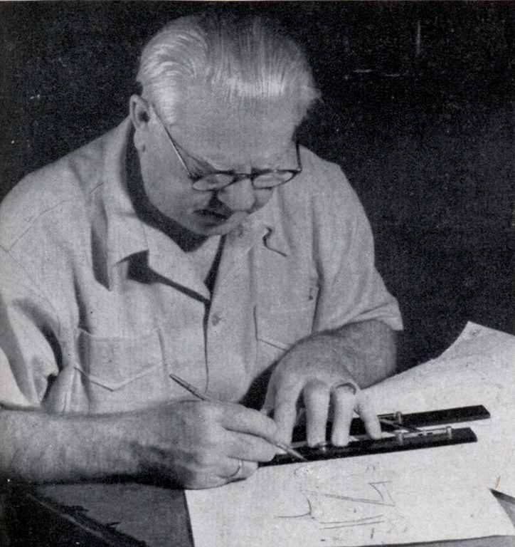
Here he is tracing the letter on Bristol board. If there are any irregularities in the design they are smoothed out carefully at this stage of the work. |

Peering through a magnifying lens, he cuts the letter out of the board with a sharp, thin bladed tool, held perpendicular to produce a clean, even edge. |


Three great crises mark his busy and productive life. As a young man he moved to Chicago from Bloomington, Ill., where he was born March 8, 1865. He kept books several years for a real-estate firm, appraising lands and writing an occasional ad. Lettering interested him greatly, and in 1895 he submitted a set of capital letters to the Dickinson Type Foundry in Boston.
“Might these be worth five dollars?” he queried.
To his amazement, the foundry accepted his design, sending a check for $10. Jubilant over his good luck, Goudy grabbed a pencil and rapidly made a few calculations.
“Ten dollars for a half hour’s work,” he mused, “or $20 an hour, or $160 a day. Boy, that’s fast money.”
He’d made his fortune on paper! Unhappily, however, not another sale came his way for three years.
In fact, a decade was to pass before his mounting interest in typography led him to break away from the bookkeeper’s desk. Then he started a small print shop in Chicago. Scarcely a year passed before the sheriff helped him move out of the room. From Chicago he moved to Hingham, Mass., where for two years he strove valiantly to eke a living from a press. Starvation instead of the sheriff drove him out this time, and he landed in New York City to try his luck at the work of commercial lettering.
By 1911 his work was attracting attention of book publishers, and in that year he received his first important commission, to make type for a book by H. G. Wells. He named the design Kennerley. Shortly Kennerley reached England and Germany, and was destined to prove the most profitable of all his designs, fetching over the years more than $25,000 in sales and royalties. Kennerley was the first American type ever sold abroad.
By the early twenties, he had made many drawings for type, from which the matrices were engraved by the late Robert Weibking in Chicago.


“His work,” Goudy told me, “was technically satisfactory, but I do not feel that type cast by any one else carries fully into print the exact qualities of rhythm and feeling I strive for in my original drawings. No punch cutter or matrix engraver, however skilful, can do more than approximate the subtleties of another’s thought and feeling.”
By 1921, Goudy had visions of carrying out with his own hands every detail, from drawing designs to casting the type. Strangely, fate forced him to take the final step. In 1925, he received a commission to furnish a private type for exclusive use by the Woman’s Home Companion. As usual, he expected to complete the designs and turn them over to Weibking, who would cut the matrices. Goudy completed his drawings in a few weeks, and the day he was to deliver them in Chicago, word came that Weibking had died. This was his second crisis.
At 60, “with more assurance than judgment,” he decided to plunge at once into the job of assembling a modest foundry. His Village Press and Letter Foundry at last was to become a true foundry. With no previous experience, Goudy began to make patterns, grind cutting tools, cast type. On delivering the job, he was able to boast authorship of every step in its conception and manufacture.
At an age when many begin to think of retiring, Goudy was just beginning to hit his stride. For 14 years he laboured in his 150-year-old shop, a three-story frame structure near his residence, replacing makeshift tools with better ones, installing permanent machinery; making hundreds of drawings, master and work patterns, and type designs. Shortly before sunup on January 26, 1939, flames from some unknown source licked at the dry timbers. In a half hour, fire swept away the accumulation of a lifetime.
His seventy-fourth birthday was only six weeks away, yet as the embers cooled, Goudy was planning ways to continue. Shortly, he turned his library into a laboratory, converted a large room into a shop, and before long was busy producing matrices for the University of California’s Old Style and seven other types which followed. Among them is his latest, a book design for the Scripps College Press in California, No. 113 in his record.
Already known as the father of an American school of design, Goudy has a deep conviction that we should encourage this movement, and not turn to foreign sources for ideas. Although his designs may embody the lovely script of Gutenberg, the beautiful proportions of a Caslon letter, the delicacy of Garamond or the contrasting weight of Bodoni, any or all€”he doesn’t believe in casting aside the historic forms he usually insists on adapting them to up-to-date needs. And he’s one of the few men since the invention of type who can do the entire job, from sketching to casting and printing.


When at last, in consultation with a client, he determines the uses to which a new face will be put and the impressions upon readers desired by a publisher, the aging master goes home to Marlboro, and there bends over his sturdy drafting table.
Unlike other draftsmen, he keeps a stack of sharp-pointed pencils close at hand. Some years ago he lost the sight of his right eye. A pen may make undesired marks in the wrong places, while lead leaves its impress only when moved. He takes no unnecessary chances in making his original drawings, because mistakes take time, and he works day and night on a new design.
Goudy first lays out five guide lines which mark the limits of the letters. One fixes the tops of such letters as b, d, and h; another the bottoms of j, p, q, and y. A third serves as a base for the row of letters as a whole, while two others determine thickness and variation at the tops of such letters as a, e, i, m, and n. These drawings usually stand 7-1/2 inches tall.
You would think that a letter, satisfactory when drawn in this comparatively large size, perhaps 90 times taller than the finished type, would be well-nigh perfect when reduced. But the original sketches are inexplicably tricky at times. In fact, the type is never exactly like the sketch, and an excellent letter may produce a decidedly unsatisfactory type face. More than once Goudy has destroyed drawings when proofs from the resulting type displeased him. “I consider a type good,” he told me, “when it can’t be any gooder.”
The completed design is traced on a large sheet of draftsman’s cardboard, and the traced letters are smoothed out to remove any irregularities. From this point on to finished type, each step requires the greatest precision. Peering through a magnifying lens, he cuts each letter out of the board with a sharp, thin-bladed knife, held perpendicular to produce an even, clear edge. After removing the letters, he cements the cut-out sheet to another piece of cardboard. The depressions, outlining the letters, then become the master pattern.
With a reproducing device called a vertical pantograph he reduces the letters by two-thirds. As he follows the recessed outlines with a fine tracing point, covering the depressions with an even pressure, a revolving chisel cuts the letters in type metal.
This metal block, duplicating the original cardboard except for size, becomes the working pattern. From this pattern, Goudy, again using the vertical pantograph, engraves the recessed brass matrices in which the final type will be cast.
This is a task few men with two good eyes would dare tackle, for the letters must be cut with perfectly smooth faces, and as the tiny chisel, which cuts a line only two one-thousandths of an inch wide, revolves, the impression must be made within a tolerance of two ten-thousandths of an inch. If too shallow, a new matrix soon will be cut; if too deep, Goudy smooths down the top, rubbing off the excess metal. When you recall that he may cut letters two inches tall today and move down to letters only a twelfth of an inch tall tomorrow, you get some idea of the painstaking care required. Goudy cuts a brass matrix for each letter, figure, and decoration of each size in which the type is to be cast.
|
Further steps in finishing the cutter point. Most type designers turn their drawings over to professional matrix engravers who performs the mechanical operation, but Goudy feels that no other man can carry the quality of his designs into type. |
Examining the finished point. The great precision of Goudy’s work is made all the more remarkable by the fact that he lost the sight in his right eye several years ago. In spite of his handicap, he carries out every detail from drawing to casting. |


You and I can’t study a column of type and describe its features. We know simply that one book or one magazine looks better than another. But why bother with a new face when many good ones are available?
“Each face,” Goudy emphasizes, “has a spirit of its own. New types express the tempo of the times.
“After all,” he adds with a smile, “it is very easy. I just think of a letter and draw a line around the thought.”
Article by Andrew R. Boone from Popular Science april 1942 .Found at blog.modernmechanix.com


Leave a comment